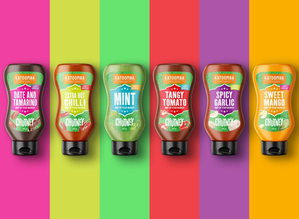
In today’s competitive food industry, standing out on the shelf is no easy feat. With hundreds of options available at a glance, brands have mere seconds to catch a consumer’s attention. Amidst the many elements that make a product attractive—like typography, imagery, and brand messaging—colour reigns supreme. It’s not just about aesthetics; colour is one of the most powerful tools in packaging design, capable of influencing emotions, perceptions, and ultimately, purchasing decisions.
Colour: A Silent Communicator
Before a consumer reads a label or even knows what’s inside, colour makes the first impression. It silently communicates mood, flavour, quality, and brand identity. Studies have shown that up to 90% of snap judgments about products can be based on colour alone.
Think about it:
- Red can trigger excitement and appetite (often used in fast food branding).
- Green is associated with health, freshness, and sustainability.
- Blue evokes trust and calmness but is used sparingly in food as it can suppress appetite.
- Yellow conveys optimism and energy.
- Black and metallics suggest luxury and sophistication.
In food packaging, choosing the right palette is crucial to setting consumer expectations before they even taste the product.
Shelf Impact: Breaking Through the Visual Clutter
The modern supermarket shelf is a battleground. Products jostle for attention, and bright, bold colours are often the difference between getting noticed and getting overlooked. In categories where neutral tones dominate—such as dairy, baked goods, or condiments—a pop of vibrant colour can be a game changer.
By using strategic colour blocking, vibrant hues, and contrasting shades, brands can make their products leap off the shelves and straight into shopping carts.
Building Brand Identity with Colour
Consistent use of a distinctive colour palette does more than attract attention—it builds brand recognition and loyalty. Some of the most iconic brands in the world are immediately recognizable by their colour schemes alone. Over time, consumers begin to associate certain feelings and expectations with specific colours and brands.
For emerging food brands, being deliberate about colour choices from the outset helps carve out a strong and memorable identity in a crowded marketplace.
Enhancing the Eating Experience
Colour doesn’t just sell—it sets the tone for the entire eating experience. Packaging that uses colour to hint at flavour (like fiery reds for spicy products or soft pastels for sweet treats) creates subconscious cues about what the consumer can expect. It builds anticipation, sets the mood, and enhances the perception of taste.
Additionally, playful or bold colour schemes can help brands position themselves as modern, fun, and approachable, attracting a younger, trend-conscious audience.
Final Thoughts: Make Colour Your Strategic Advantage
In a world where first impressions happen in milliseconds, colour is a brand’s secret weapon. It has the power to communicate, persuade, and differentiate, often before a single word is read.
Whether you are launching a new product line or refreshing an existing one, investing in a thoughtful, strategic colour palette can make all the difference between blending in—and standing out.
Looking for a standout packaging design in North Sydney?
Let’s turn colour into your brand’s superpower and bring your shelf presence to life.