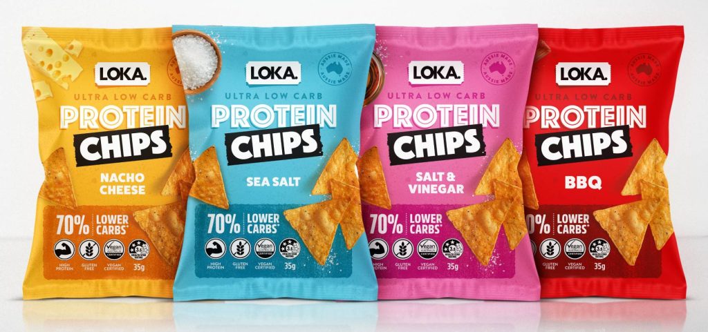
Loka Foods had a strong foundation: a range of healthier tortilla chips designed for consumers seeking better-for-you snack options. However, increasing competition in the health snack aisle and a gradual loss of market share placed greater importance on clear, confident shelf presence.
An ingredients update with an existing retailer pushed the product further into the high-protein, low-carb space. This moment highlighted the need for packaging that could better support the product’s improved credentials and help it compete more confidently in a crowded retail environment.
The Opportunity
The opportunity lay in elevating the packaging to more clearly and instantly communicate the product’s strengths, with greater visual impact on the shelf.
To achieve this, the Relax Design team focused the design evolution on:
- Reflecting the upgraded formulation
- Clarifying key health benefits
- Strengthening shelf appeal and flavour recognition
The Design Approach
The updated packaging embraced a fresh, modern, and vibrant aesthetic. A clean, minimalist layout was introduced to improve clarity and reduce visual noise, allowing key health benefits — low carb, high protein, gluten-free, and vegan — to stand out at a glance.
Bold, vibrant colours were used to differentiate flavours and create a stronger shelf presence, appealing to health-conscious consumers who still want excitement from their snack choices. A clear visual hierarchy guided the eye from brand to benefit to flavour, ensuring quick and confident decision-making at the shelf.
The Result
The redesign reinforces the brand’s health credentials while making the product more noticeable, more engaging, and more competitive — proving that thoughtful packaging design isn’t about fixing a problem, but unlocking a product’s full potential.
Great Products deserve Great Packaging. Let’s build yours.