Tonic Alchemy Hits the Shelves with Increased Confidence
A small brand occupying the wellness space Tonic Alchemy was one of the first to hit the market over 5 years ago marketing a range of different wellness shots. In that time new and bigger entrants have hit the shelves and in an effort to be more relevant the packaging unfortunately has had a few different iterations and become inconsistent in the different retail channels.
To us it was obvious, create better shelf impact, make the brand hero and apply a level of disruption to the design.
The Solution
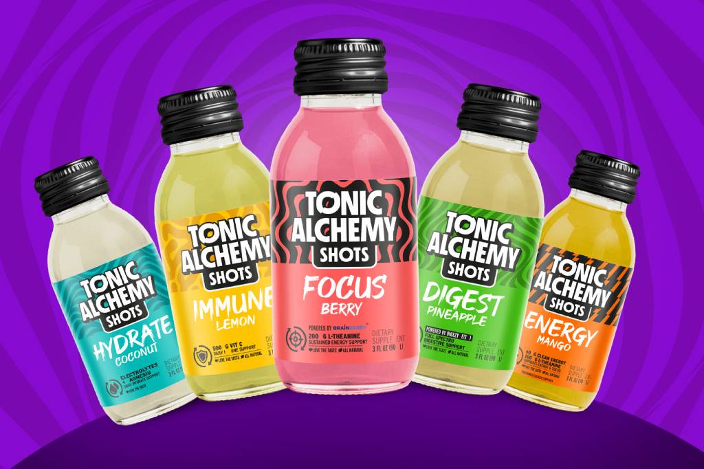
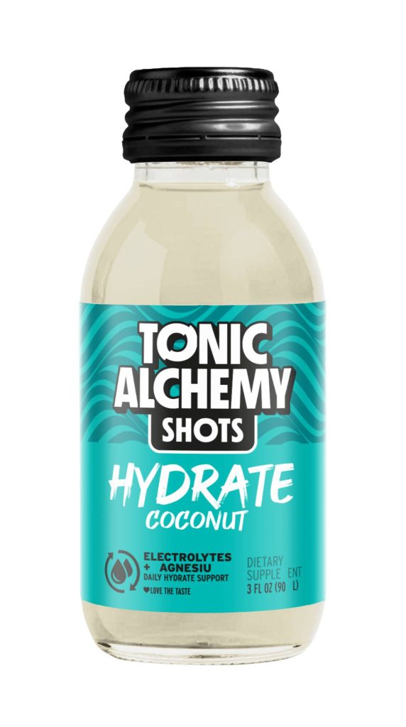
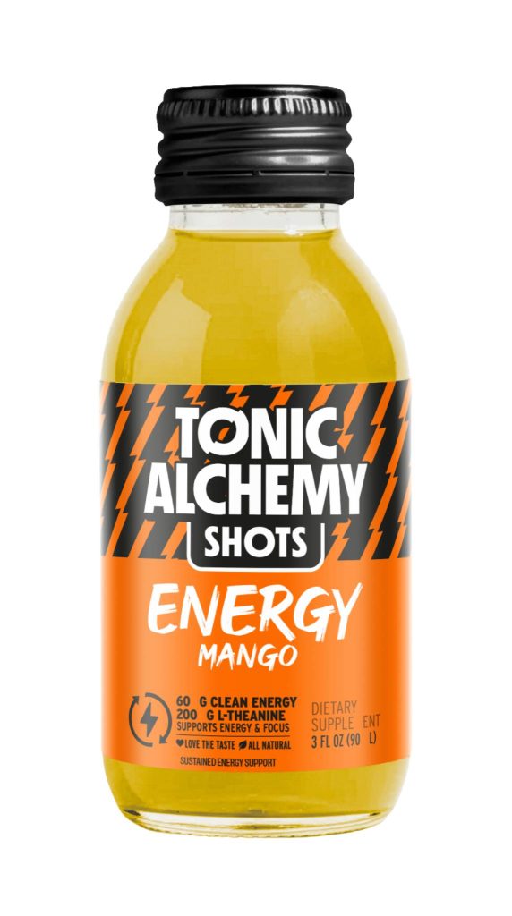
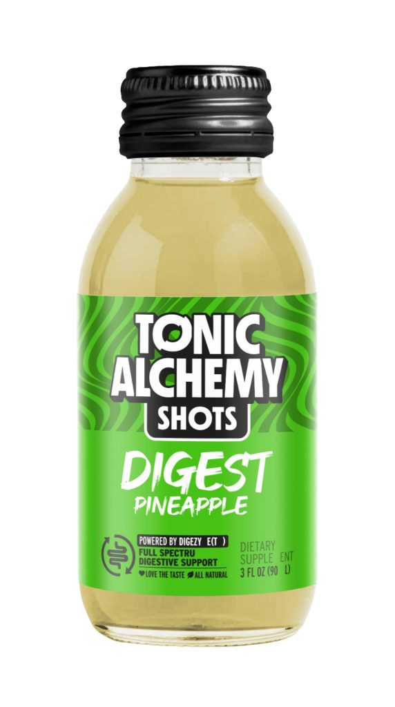
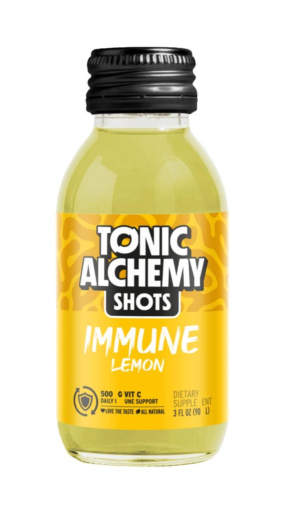
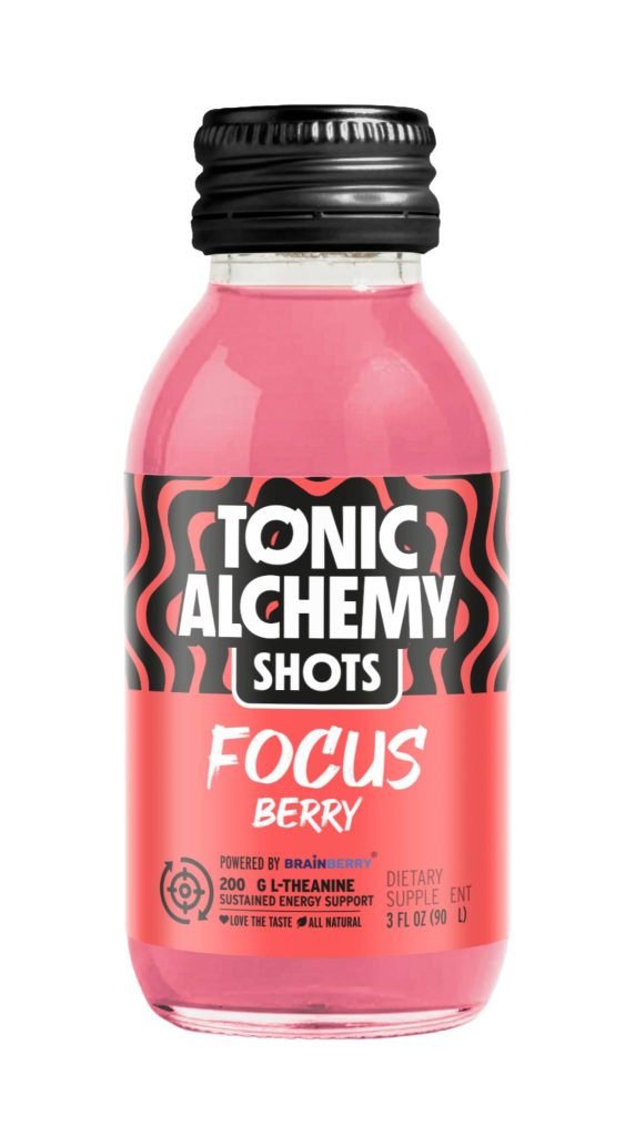
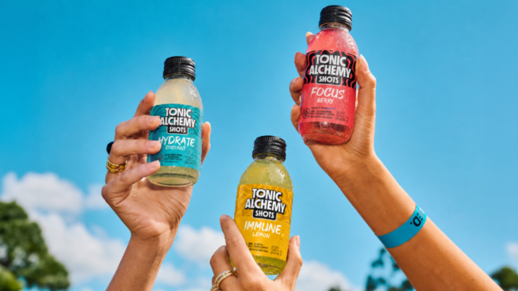
For Tonic Alchemy, the design approach was to create a bold, energetic system that visually captures the functional nature of the range while giving each shot a distinct personality. We used strong colour coding, expressive patterning and a punchy typographic hierarchy to build a family that feels dynamic, modern and easy to navigate, while still maintaining a cohesive brand presence across the range.